軸範囲と軸ラベル設定
Matplotlib では、特に何も指定しなければ自動的に軸範囲が設定されますが、自分で設定することもできます。また、各軸にラベルを添えることもできます。
軸範囲の設定
x 軸, y 軸の範囲は、それぞれ Axes.set_xlim() と Axes.set_ylim() によって設定できます。
# MATPLOTLIB_SET_LIM

# In[1]

# 必要なモジュールをインポート
import numpy as np
import matplotlib.pyplot as plt

# Figureを設定
fig = plt.figure()

# グラフ描画領域を追加
ax = fig.add_subplot(111)

# Axesのタイトルを設定
ax.set_title("y = xlogx", fontsize=16)

# 0.1~4.0まで0.01刻みのデータを作成
x = np.arange(0.1, 4.0, 0.01)

# y=xlogx
y = x * np.log(x)

# 軸範囲の設定
ax.set_xlim(0, 2)
ax.set_ylim(-1, 2)

# データをプロット
ax.plot(x, y, color = "r")
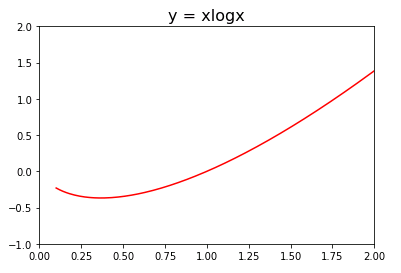
このコードでは x のデータは 0.1 ~ 4.0 まで 0.01 刻みで作成しますが、ax.set_xlim()メソッドで x 軸の範囲を 0 ~ 2 に設定してあるので、その範囲でグラフが表示されています。
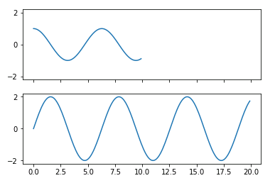
subplots()関数の sharex、sharey オプションに True を渡すと、すべての Axes の x 軸、y 軸の軸範囲が揃えられます。
# In[2]

# (x,y)データの作成
x1 = np.arange(0, 10, 0.1)
y1 = np.cos(x1)
x2 = np.arange(0, 20, 0.1)
y2 = 2 * np.sin(x2)

# Figureオブジェクトと2行1列のAxes配列を作成
fig, ax = plt.subplots(2, 1, sharex=True, sharey=True)

ax[0].plot(x1, y1)
ax[1].plot(x2, y2)
対数軸の設定
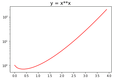
x 軸、y 軸を対数軸に設定する場合は、それぞれ Axes.set_xscale()、 Axes.set_yscale() の引数に “log” を渡します。片方の軸を対数軸に設定すると片対数、両軸を対数軸に設定すると両対数グラフとなります。
# MATPLOTLIB_SET_SCALE

# In[1]

import numpy as np
import matplotlib.pyplot as plt

# Figureを設定
fig = plt.figure()

# Axesを追加
ax = fig.add_subplot(111)

# Axesのタイトルを設定
ax.set_title("y = x**x", fontsize=16)

# 0~4.0まで0.01刻みのデータを作成
x = np.arange(0, 4.0, 0.1)

# y=x**x
y = x ** x

# x軸を対数軸に設定
ax.set_yscale("log")

# データをプロット
ax.plot(x, y, color="r")
軸ラベルの設定
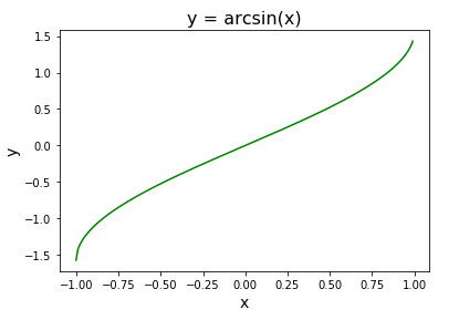
Axes.set_xlabel()、Axes.set_ylabel() で x 軸、y 軸にラベルを添えることができます。第2引数以降でフォントのスタイルやサイズ、太さなどを設定できます。
# MATPLOTLIB_SET_LABEL

# In[1]

import numpy as np
import matplotlib.pyplot as plt

fig = plt.figure()
ax = fig.add_subplot(111)
ax.set_title("y = arcsin(x)", fontsize = 16)

# 軸ラベルの設定
ax.set_xlabel("x", size=14, weight="light")
ax.set_ylabel("y", size=14, weight="light")

# xのデータを作成 [-1~1], Δx = 0.1
x = np.arange(-1, 1, 0.01)

# y=arcsin(x)
y = np.arcsin(x)

# データをプロット
ax.plot(x, y, color="g")
コメント