ビジネスでも科学論文でも、縦棒(あるいは横棒)グラフはデータを分かりやすく可視化するツールとして重宝されます。この記事では NumPy と Matplotlib を組み合わせて、棒グラフを描く方法やカスタマイズについて解説します。
【Matplotlib】縦棒グラフ
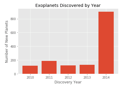
Axes.bar() を使って 縦棒グラフ を作成できます。以下のサンプルコードは太陽系外惑星 (Exoplanets) の年毎の発見数を縦棒グラフで可視化します。
# MATPLOTLIB_BAR

# In[1]

import numpy as np
import matplotlib.pyplot as plt

# 太陽系外惑星の発見年(Discovery Year)
y = [2010, 2011, 2012, 2013, 2014]

# 太陽系外惑星の発見数(Number of New Planets)
n = [119, 185, 123, 132, 904]

# 描画スタイルを設定
plt.style.use("ggplot")

# タイトルと軸ラベルの設定関数
def set_exoplanets(ax):
    ax.set_title("Exoplanets Discovered by Year", fontsize=14)
    ax.set_xlabel("Discovery Year", fontsize=12)
    ax.set_ylabel("Number of New Planets", fontsize=12)

# FigureとAxesを作成
fig, ax = plt.subplots()

# タイトルと軸ラベルを設定
set_exoplanets(ax)

# Axesに縦棒グラフを追加
ax.bar(y, n)

plt.show()
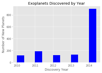
 棒 (bar) のスタイルをカスタマイズしてみましょう。
color 引数で棒の塗りつぶし色を指定できます。
width に 0 ~ 1 の範囲の数値を渡して棒の幅を設定できます (デフォルトは 0.8)。
最大値 1 を指定すると隣り合う棒の間に隙間がなくなります。
棒の位置 (align) はデフォルトでは “center” ですが、”edge” を渡すと、棒の左端がx軸目盛の位置となります。
# In[2]

fig, ax = plt.subplots()
set_exoplanets(ax)

# Axesに棒グラフを追加
# 塗り潰しの色(color)を青に設定
# 棒の幅(width)を0.5に設定
# 棒の左端がx軸目盛になるように位置(align)を設定
ax.bar(y, n, color="blue", width=0.4, align="edge")

plt.show()
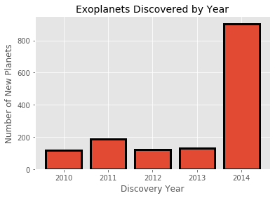
棒 (bar) に縁 (edge) をつけることもできます。
縁の幅は linewidth で、縁の色は edgecolor で指定します。
# In[3]

fig, ax = plt.subplots()
set_exoplanets(ax)

# Axesに棒グラフを追加
# 棒の縁の太さ(linewidth)を3に設定
# 縁の色(edgecolor)を黒に設定
ax.bar(y, n, linewidth=3, edgecolor="black")

plt.show()
【Matplotlib】横棒グラフ
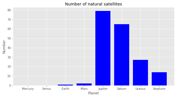
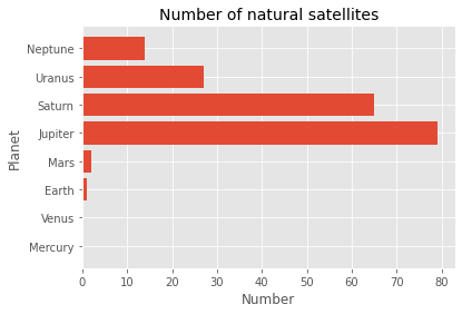
matplotlib.axes.Axes.barh() を使うと 横棒グラフ を作成できます。以下のコードは太陽系の各惑星の衛星(月)の数を横棒グラフで表示させます。
# MATPLOTLIB_BARH

# In[1]

import numpy as np
import matplotlib.pyplot as plt

# 惑星名
# [水星、金星、地球、火星、木星、土星、天王星、海王星]
planets = ["Mercury", "Venus", "Earth", "Mars",
           "Jupiter", "Saturn", "Uranus", "Neptune"]

# 惑星の衛星数
number = [0, 0, 1, 2, 79, 65, 27, 14]

# 描画スタイルを設定
plt.style.use("ggplot")

# タイトルと軸ラベルの設定関数
def set_satellites(ax):
    ax.set_title("Number of natural satellites", fontsize=14)
    ax.set_xlabel("Number", fontsize=12)
    ax.set_ylabel("Planet", fontsize=12)

# プロットエリアを準備
fig, ax = plt.subplots()

# Axesのタイトルと軸ラベルの設定
set_satellites(ax)

# Axesに横棒グラフを追加
ax.barh(planets, number)

plt.show()
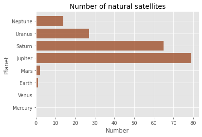
Axes.barh() には横棒のスタイルをカスタマイズするための引数が揃っています。たとえば、color で棒の塗り潰しの色、alpha で塗り潰しの透明度を設定できます。
# In[2]

fig, ax = plt.subplots()
set_satellites(ax)

# Axesに棒グラフを追加
# 棒の塗り潰し色をsienna、透明度を0.8に設定
ax.barh(planets, number, color="sienna", alpha=0.8)

plt.show()
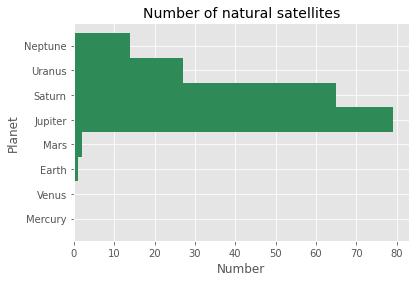
height は棒の幅を設定します。height は Axes.bar() の width に相当する引数です (棒が横向きなので高さで幅を指定します)。
# In[3]

fig, ax = plt.subplots()
set_satellites(ax)

# Axesに棒グラフを追加
# 棒の塗り潰し色をseagreen,棒の縦幅を1に設定
ax.barh(planets, number, color="seagreen", height=1)

plt.show()
コメント
下記は誤植と思われますので、ご確認ください。
BAR_GRAPH_02プログラムで、
ax.set_xlabel(“Planet”, fontsize = 12) → ax.set_xlabel(“Number”, fontsize = 12)
ax.set_ylabel(“Number”, fontsize = 12) → ax.set_ylabel(“Planet”, fontsize = 12)
〈豆情報〉デフォルトのスタイルで棒グラフを作ると、グリッド線がグラフの前に引かれるのでうるさかったのですが、下記の 1 行を加えることでグリッド線をグラフの後ろに引くことができました。
ax.set_axisbelow(True)
私の使っている環境では、ローカルでも Google Colab でも、デフォルトで ax.set_axisbelow() が True になっているようでした。逆に ax.set_axisbelow(False) を追加してみると、グリッド線がグラフの前に引かれるようになりました。バージョンによって、Matplotlib のデフォルト設定が微妙に異なっているようです。いずれにしても、グリッド線は後ろにあったほうがいいですね。(^^)
もう一度試してみましたが、私の環境では ax.set_axisbelow(True) をコメントアウトして実行すると、グリッドがグラフの前に引かれてしまいますね。
あと先回言い忘れましたが、BAR_GRAPH_02 の In[2] と In[3] の実行結果でも、軸ラベルの Planet と Number が入れ替わっていますので、ご確認ください。
ありがとうございます。
正しい図に差し替えておきました。m(_ _)m