
色の指定方式
Matplotlibではオブジェクトに色をつけるために様々な方式のカラーコードを指定することができます。
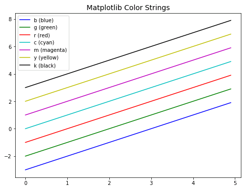
カラーストリング
Matplotlib に用意されているカラーストリングを使用する場合は、”b” や “r” のように1文字で色を指定します。
# MATPLOTLIB_COLOR

import matplotlib.pyplot as plt
import numpy as np

# 8×6サイズのFigureを追加
fig = plt.figure(figsize=(8, 6))

# FigureにAxesを追加
ax = fig.add_subplot(111)

# Axesのタイトルの設定
ax.set_title("Matplotlib Color Strings", fontsize=14)

# (x,y)データを作成
x = np.arange(0, 5, 0.1)
y = x

# Matplotlibカラーストリングによる色指定
ax.plot(x, y - 3, label="b (blue)", color="b")
ax.plot(x, y - 2, label="g (green)", color="g")
ax.plot(x, y - 1, label="r (red)", color="r")
ax.plot(x, y, label="c (cyan)", color="c")
ax.plot(x, y + 1, label="m (magenta)", color="m")
ax.plot(x, y + 2, label="y (yellow)", color="y")
ax.plot(x, y + 3, label="k (black)", color="k")

# 凡例の表示
ax.legend()
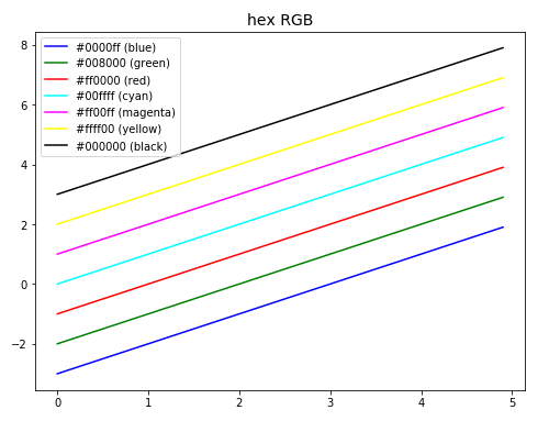
hexRGBカラーコード
hexRGB は 3原色 Red (赤), Green (緑), Blue(青) の度合いを 16進数表記 00 ~ ff で表す方式です。最大値 ff は 10進数表記 255 に相当します。
# MATPLOTLIB_COLOR_HEXRGB

import matplotlib.pyplot as plt
import numpy as np

fig = plt.figure(figsize=(8, 6))
ax = fig.add_subplot(111)
ax.set_title("hex RGB", fontsize=14)

# (x,y)データを作成
x = np.arange(0, 5, 0.1)
y = x

# hexRGBカラーコードによる色指定
ax.plot(x, y - 3, label="#0000ff (blue)", color="#0000ff")
ax.plot(x, y - 2, label="#008000 (green)", color="#008000")
ax.plot(x, y - 1, label="#ff0000 (red)", color="#ff0000")
ax.plot(x, y, label="#00ffff (cyan)", color="#00ffff")
ax.plot(x, y + 1, label="#ff00ff (magenta)", color="#ff00ff")
ax.plot(x, y + 2, label="#ffff00 (yellow)", color="#ffff00")
ax.plot(x, y + 3, label="#000000 (black)", color="#000000")

# 凡例の表示
ax.legend()
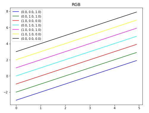
RGBカラーコード
RGB は 3原色 Red (赤), Green (緑), Blue(青) の度合いを 0.0 ~ 1.0 の浮動小数点数で表す方式です。
# MATPLOTLIB_COLOR_RGB

import matplotlib.pyplot as plt
import numpy as np

fig = plt.figure(figsize=(8, 6))
ax = fig.add_subplot(111)
ax.set_title("RGB", fontsize=14)

# (x,y)データを作成
x = np.arange(0, 5, 0.1)
y = x

# RGB方式による色指定
ax.plot(x, y - 3, label="(0.0, 0.0, 1.0)", color=(0.0, 0.0, 1.0))
ax.plot(x, y - 2, label="(0.0, 1.0, 1.0)", color=(0.0, 0.5, 0.0))
ax.plot(x, y - 1, label="(1.0, 0.0, 0.0)", color=(1.0, 0.0, 0.0))
ax.plot(x, y, label="(0.0, 1.0, 1.0)", color=(0.0, 1.0, 1.0))
ax.plot(x, y + 1, label="(1.0, 0.0, 1.0)", color=(1.0, 0.0, 1.0))
ax.plot(x, y + 2, label="(1.0, 1.0, 0.0)", color=(1.0, 1.0, 0.0))
ax.plot(x, y + 3, label="(0.0, 0.0, 0.0)", color=(0.0, 0.0, 0.0))

# 凡例の表示
ax.legend()
matplotlib.colorsモジュールにある to_rgb()関数を用いると、引数に指定した色の RGBカラーコードを知ることができます。
import matplotlib.colors as mtc
import numpy as np

#crimsonのRGBカラーコードを取得
mtc.to_rgb("crimson")
# (0.8627450980392157, 0.0784313725490196, 0.23529411764705882)
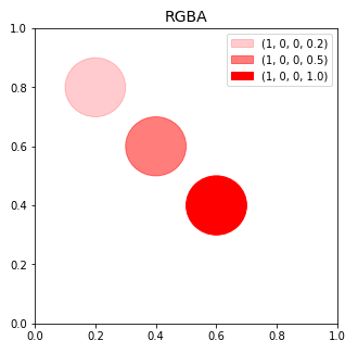
RGBAカラーコード
RGBA は RGB に透明度のオプションを加えた方式です。透明度は 0 ~ 1 の範囲で指定します。0 を指定すると完全に透明、1 を指定すると完全に不透明となります。
# MATPLOTLIB_COLOR_RGBA

import matplotlib.pyplot as plt
import matplotlib.patches as pat

fig = plt.figure(figsize=(5, 5))
ax = fig.add_subplot(111)
ax.set_title("RGBA", fontsize=14)

# matplotlib.patches.Circleインスタンス
# radiusは半径、colorは塗り潰しの色と透明度
c1 = pat.Circle(xy=(0.2, 0.8), radius=0.1,
                label="(1, 0, 0, 0.2)", color=(1, 0, 0, 0.2))

c2 = pat.Circle(xy=(0.4, 0.6), radius=0.1,
                label="(1, 0, 0, 0.5)", color=(1, 0, 0, 0.5))

c3 = pat.Circle(xy=(0.6, 0.4), radius=0.1,
                label="(1, 0, 0, 1.0)", color=(1, 0, 0, 1.0))

# Axesに円cを追加
ax.add_patch(c1)
ax.add_patch(c2)
ax.add_patch(c3)

# 凡例の表示
ax.legend()
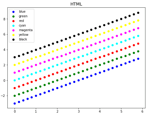
HTMLカラーネーム
マークアップ言語の HTML, CSS で使用されるカラーネームを指定することもできます。
# MATPLOTLIB_COLOR_NAME

import matplotlib.pyplot as plt
import numpy as np

fig = plt.figure(figsize=(8, 6))
ax = fig.add_subplot(111)
ax.set_title("HTML", fontsize=14)

# (x,y)データを作成
x = np.arange(0, 6, 0.2)
y = x

# HTMLカラーネームによる色指定
ax.scatter(x, y - 3, label="blue", color="blue")
ax.scatter(x, y - 2, label="green", color="green")
ax.scatter(x, y - 1, label="red", color="red")
ax.scatter(x, y, label="cyan", color="cyan")
ax.scatter(x, y + 1, label="magenta", color="magenta")
ax.scatter(x, y + 2, label="yellow", color="yellow")
ax.scatter(x, y + 3, label="black", color="black")

# 凡例の表示
ax.legend()
使用できる色の一覧を取得
colors モジュールの cnames 属性には、Matplotlib で使用できる色の一覧 (色の名称とカラーコード) が辞書形式で収められています。
# MATPLOTLIB_COLOR_LIST

from matplotlib import colors

# Matplotlib で使用できる色の一覧を取得する
color_dic = colors.cnames

color_dic
{'aliceblue': '#F0F8FF',
 'antiquewhite': '#FAEBD7',
 'aqua': '#00FFFF',
 'aquamarine': '#7FFFD4',
 'azure': '#F0FFFF',
 'beige': '#F5F5DC',
 'bisque': '#FFE4C4',
 ・・・・・・・・・・・・
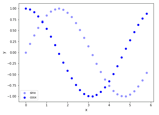
透明度の設定 (alphaオプション)
プロットの透明度は alpha オプションで設定できます。alpha=1 で完全不透明、alpha=0 で完全透明となります。
# MATPLOTLIB_TRANSPARENT

# In[1]

import matplotlib.pyplot as plt
import numpy as np

fig = plt.figure(figsize=(8, 6))
ax = fig.add_subplot(111)

# (x,y)データを作成
x = np.arange(0, 6, 0.2)
y1 = np.sin(x)
y2 = np.cos(x)

# 軸ラベルの設定
ax.set_xlabel("x", fontsize=12)
ax.set_ylabel("y", fontsize=12)

# 散布図の作成
ax.scatter(x, y1, label="sinx", color="blue", alpha=0.4)
ax.scatter(x, y2, label="cosx", color="blue", alpha=1.0)

# 凡例の表示
ax.legend()
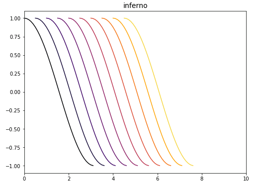
カラーマップ
matplot.cmモジュールにはカラーマップが用意されています。カラーマップとは引数として与える浮動小数点数 0 ~ 1 に対応して連続変化する色の組合わせを定義したものです。
下のサンプルコードは、inferno というカラーマップを使って、引数を 0 から 1 まで 0.1 刻みで与えながらプロットに色をつけたものです。
# MATPLOTLIB_COLORMAP

# In[1]

import numpy as np
import matplotlib.cm as cm
import matplotlib.pyplot as plt

# サイズ8×6のFigureを追加
fig = plt.figure(figsize=(8, 6))

# FigureにAxesを追加
ax = fig.add_subplot(111, xlim=(0, 10))

# Axesのタイトルの設定
ax.set_title("inferno", fontsize=14)

# (x,y)データを作成
x = np.arange(0, 3.2, 0.1)
y = np.cos(x)

# inferno(0)からinferno(1)まで0.1ステップで色を変えながら表示
for k in range(10):
    ax.plot(x + k/2, y,
    color=cm.inferno(k/10))
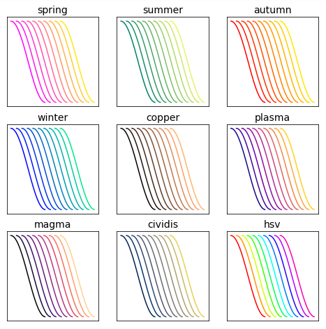
Matplotlib のカラーマップには Reds, Greens, Blues, Greys, Oranges といった基本的な色のマップの他に、summer, spring, autumn, winter, copper, plasma, inferno, magma など、名前だけではどのような色か判別しにくい色のマップが用意されています。以下に 9 種類のカラーマップを表示させるサンプルコードとその実行結果を載せておくので、カラーマップを選択するときの参考にしてください。
# In[2]

# サイズ8×8のFigureを追加
fig = plt.figure(figsize=(8, 8))

# カラーマップ名のリスト
cmap_list = ["spring", "summer", "autumn",
             "winter", "copper", "plasma",
             "magma", "cividis", "hsv"]

# matplotlib.cmリスト
cm_list = [cm.spring, cm.summer, cm.autumn,
           cm.winter, cm.copper, cm.plasma,
           cm.magma, cm.cividis, cm.hsv]

# (x,y)データを作成
x = np.arange(0, 3.2, 0.1)
y = np.cos(x)

for j in range(1, 10):

    # 3行3列のj番目のAxesを追加
    ax = fig.add_subplot(3, 3, j)

    # Axesのタイトル設定
    ax.set_title(cmap_list[j-1], fontsize=14)

    # 目盛りを除去
    ax.set_xticks([])
    ax.set_yticks([])

    # 目盛ラベルを除去
    ax.set_xticklabels([])
    ax.set_yticklabels([])

    for k in range(10):
        ax.plot(x + k/2, y, color=cm_list[j-1](k/10))
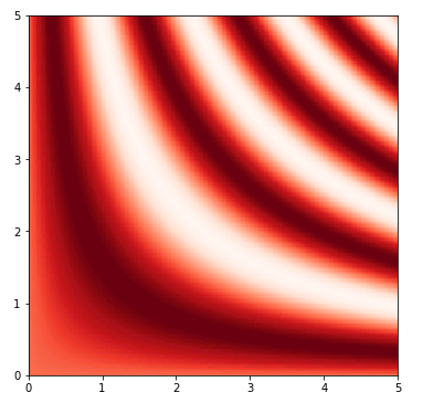
カラーマップは等高線を描くときに頻繁に活用されます。
matplotlib.pyplot.pcolormesh() の引数 cmap にカラーマップを指定すると色の濃淡で高低差を表現します。
# In[3]

# 6×6のFigureを追加
fig = plt.figure(figsize=(6, 6))

# FigureにAxesを追加
ax = fig.add_subplot(111)

# 範囲0~5,256分割で(x,y)データを作成
x = np.linspace(0, 5, 256)
y = np.linspace(0, 5, 256)

# 格子点の作成
X, Y = np.meshgrid(x, y)

# 高度の計算式
Z = np.sin(X*Y)

# 色つき等高線の描画
ax.pcolormesh(X, Y, Z, cmap="Reds")
コメント
下記は誤植と思われますので、ご確認ください。
「hexRGBカラーコード」の説明文で、ff は 10進数表記 256 → ff は 10進数表記 255
ffの10進数表記は … ええと … 15*(16^1) + 15*(16^0) = 255 ですね。
間違えていました。申し訳ないです。
訂正しておきました。m(_ _)m