【Matplotlib】散布図をプロットする方法
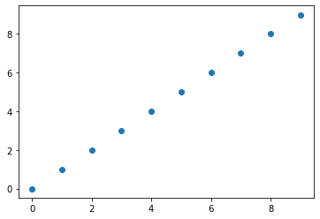
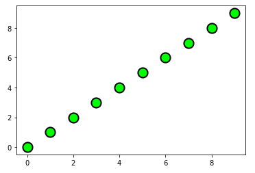
matplotlib.axes.Axes.scatter() または matplotlib.pyplot.scatter を使って、データを散布図として可視化できます。簡単な例として、デフォルト設定で直線 y=x 上の整数点を散布図としてプロットしてみましょう。
# MATPLOTLIB_SCATTER

# In[1]

import numpy as np
import matplotlib.pyplot as plt

# Figureを作成してAxesを追加
fig = plt.figure()
ax = fig.add_subplot(111)

# 直線y=xのデータ
x = np.arange(0, 10)
y = x

# Axesに散布図をプロット
ax.scatter(x, y)

# 散布図を描画
plt.show()
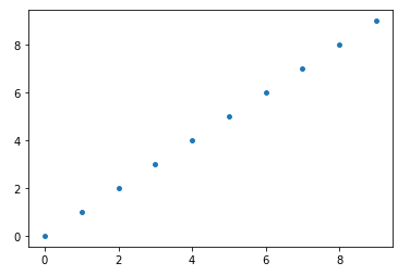
【散布図】マーカーのサイズ(s)
引数 s で散布図のマーカーのサイズを指定できます。
# In[2]

# Axesをクリア
ax.cla()

# マーカーサイズ15で散布図をプロット
ax.scatter(x, y, s=15)

# Figureを再表示
display(fig)
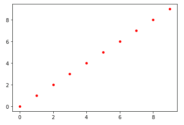
【散布図】マーカーの色(color)
c または color で散布図の各点の色を指定できます。
# In[3]

# Axesをクリア
ax.cla()

# マーカーのサイズを15、色を赤に指定して散布図をプロット
ax.scatter(x, y, s=15, color="red")

# Figureを再表示
display(fig)
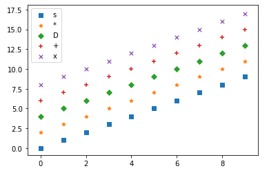
【散布図】マーカーの種類(marker)
marker でマーカーの種類(形状)を指定できます。たとえば、四角形は ‘s’(square)、ひし形は ‘D’(diamond)、× 印は ‘x’ で指定します。
# In[4]

# Axesをクリア
ax.cla()

# マーカーの種類
marker_list = ["s", "*", "D", "+", ""]

# マーカーリストの大きさ
m_size = len(marker_list)

# マーカーの種類を変更しながら散布図をプロット
for k in range(m_size):
    ax.scatter(x, x + 2*k,
               s = 30, marker=marker_list[k],
               label=marker_list[k])

# 凡例を表示
ax.legend()

# Figureを再表示
display(fig)
【散布図】マーカーの縁の太さ(linewidth)と色(edgecolors)
linewidth で縁の太さを指定して、マーカーに縁(edge)を付けることもできます(デフォルトでは linewidth=0 に設定されているので縁がつきません)。edgecolors で縁の色を指定できます。
# In[5]

# Axesをクリア
ax.cla()

# マーカーの縁の太さを2、縁の色を黒に指定して散布図をプロット
ax.scatter(x, y, s = 200, c="lime",
           linewidths=2, edgecolors="black")

# Figureを再表示
display(fig)
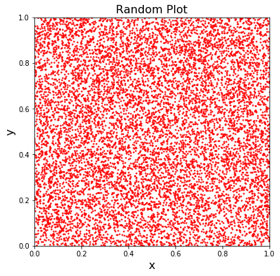
numpy.random.rand() を使って [0, 1] のランダムな点 (x, y) を 10000 組生成し、散布図としてプロットしてみます。一様乱数なので平面全体に均一に分布するはずです。
# In[6]

# FigureとAxesを設定
fig = plt.figure(figsize=(6, 6))
ax = fig.add_subplot(111)
ax.set_xlim(0, 1)
ax.set_ylim(0, 1)
ax.set_title('Random Plot', fontsize=16)
ax.set_xlabel('x', fontsize=16)
ax.set_ylabel('y', fontsize=16)

# ランダムな点(x,y)を10000個生成
x = np.random.rand(10000)
y = np.random.rand(10000)

# 散布図をプロット
ax.scatter(x, y, s=2, color="red")

# グラフを描画
plt.show()
最後に、データ分析における実践的な散布図の用い方を見てみましょう。scikit-learn.datasets から「ボストンの住宅価格データセット」を読み込んでみます (scikit-learn は Anaconda に同梱されている機械学習用ライブラリです)。
# MATPLOTLIB_BOSTON_HOUSING_PRICE

# In[1]

# scikit-learnから「ボストンの住宅価格データセット」を読み込む
from sklearn.datasets import load_boston

data = load_boston()
load_boston には、米国のボストン市郊外の 506 の地域について、13 種類の特徴量 (犯罪発生数や不動産税率など) と、住宅価格の中央値が収められています。
# In[2]

# 特徴量(説明変数)の一覧を取得
print(data.feature_names)

# ['CRIM' 'ZN' 'INDUS' 'CHAS' 'NOX' 'RM' 'AGE' 'DIS' 'RAD' 'TAX' 'PTRATIO' 'B' 'LSTAT']
この中から、平均部屋数 (RM) と人口に占める低所得者の割合 (LSTAT) を選んで、住宅価格との関連性を調べてみることにします。
# In[3]

# 特徴量(説明変数)から150個のデータを抽出
feature = data.data[0:150]

# 住宅価格(目標変数)から150個のデータを抽出
price = data.target[0:150]

# 平均部屋数(average number of rooms per dwelling)
rm = feature[:, 5]

# 低所得者の割合(lower status of the population)
lstat = feature[:, 12]
以下のコードを実行すると、横軸に RM, 縦軸に LSTAT をとり、住宅価格をマーカーのサイズと色で表現する散布図が表示されます。
# In[4]

# FigureとAxesの設定
fig = plt.figure(figsize=(7.5, 5))
ax = fig.add_subplot(111)
ax.set_title('Boston house prices', fontsize=15)
ax.set_xlabel('average number of rooms per dwelling', fontsize=12)
ax.set_ylabel('lower status of the population', fontsize=12)

# 散布図をプロット
# マーカーのサイズと色は価格に連動
ax.scatter(rm, lstat, s=np.exp(price/6),
           c=price, cmap="plasma_r", alpha=0.75)

plt.show()
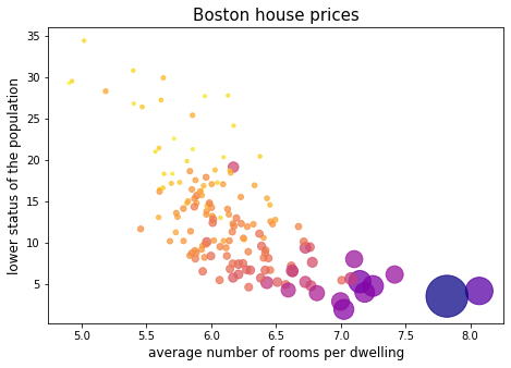
cmap を指定することにより、マーカーのサイズと色は住宅価格に連動するように設定しています。つまり、マーカーサイズが大きいほど、あるいは色が濃いほど、住宅価格が高いことを意味します。このように散布図を効果的に使うと、データの関連性を直感的に把握しやすくなります。たとえば上の散布図を見ると、平均部屋数が多くて低所得者数が少ないほど、住宅価格は高くなる傾向にあることがわかります。
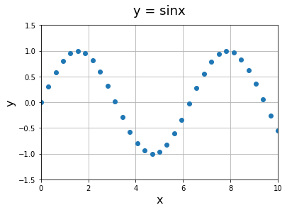
Axes.plot() の第 3 引数に Markers を指定して散布図を描くこともできます。matplotlib.axes.Axes.plot() は広範囲のプロット・スタイルを提供しており、散布図は選択肢の1つといえます。
# MATPLOTLIB_PLOT_SCATTER

# In[1]

# FigureとAxes
fig = plt.figure()
ax = fig.add_subplot(111)
ax.grid()
ax.set_xlim(0, 10)
ax.set_ylim(-1.5, 1.5)
ax.set_title('y = sinx', fontsize=18, pad=15)
ax.set_xlabel('x', fontsize=16)
ax.set_ylabel('y', fontsize=16)

# データ(x,y)を作成
x = np.linspace(0, 10, 33)
y = np.sin(x)

# 散布図をプロット
ax.plot(x, y, "o")

# グラフを描画
plt.show()
コメント
【プログラミング日記】当サイトや Excel VBA 数学教室 では、MathJax という JavaScriptライブラリを使って数式を表示していますが、一般にブラウザで数式を読み込むと、それなりの時間がかかります。IE だと 20 秒ぐらいかかります。数学サイトを始めた当初は「読み込みの遅さがサイト運営のネックになるかもしれない」と心配していました。ところが近年の Google Chrome は驚くほど処理速度を向上させていて、MathJax の数式もほとんど一瞬で表示させます。ただし、IE のほうはまったく変わっていないので、両者の機能差は開くばかりです。さらに当サイトが利用する xserver も高速表示機能(ブラウザキャッシュや X アクセラレータ)を立て続けに提供し始めました。このサイトもおそらく今月中には高速化される予定です。サーバーの機能強化によって、IE による表示も改善が図れるかもしれません。
下記は誤植と思われますので、ご確認ください。
In[6] プログラムのコメントで、1000個生成 → 10000個生成
ありがとうございます。
直しておきました。m(_ _)m