【Matplotlib】FigureとAxesにタイトルを添付する
Figure.suptitle() メソッド で Figureタイトル 、Axes.set_title() メソッド で Axesタイトル を設定できます。オプション引数でタイトル文字の色や大きさなどを指定することもできます。
Figure title
matplotlib.figure.Figure.suptitle() は Figureタイトルを設定するメソッドです。最初にデフォルト設定でタイトルを添付してみます。
# PYTHON_MATPLOTLIB_FIGURE_TITLE

# In[1]

import matplotlib.pyplot as plt
fig = plt.figure(figsize=(4, 4))
ax = fig.add_subplot(111)

fig.suptitle("Title_F")
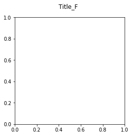
このように、デフォルト設定では Figure 上部のセンターの位置 (x=0.5, y=0.98) にタイトルが表示されます。位置引数を x=0, y=0 に設定すると、Figure の左下隅にタイトルが表示されます。
# In[2]

fig = plt.figure(figsize=(4, 4))
ax = fig.add_subplot(111)

# (x,y)=(0,0)にタイトルを添付
fig.suptitle("Title_F", x=0, y=0)
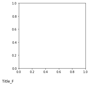
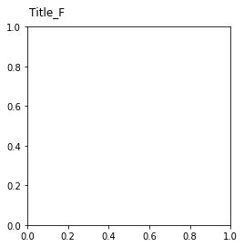
たとえば、Figure上部の左寄りにタイトルを付けたい場合などには、x と y で添付位置を調整してください。
# In[3]

fig = plt.figure(figsize=(4, 4))
ax = fig.add_subplot(111)

# タイトルの位置を調整
fig.suptitle("Title_F", x=0.2, y=0.96)
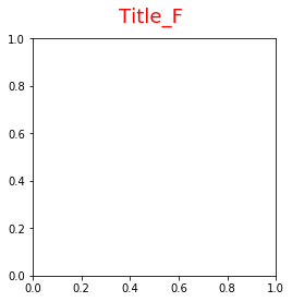
size で文字サイズ、weight で文字の太さ、color で文字の色を設定できます。
# In[4]

fig = plt.figure(figsize=(4, 4))
ax = fig.add_subplot(111)

# タイトルのフォントサイズ、太さ、色を設定
fig.suptitle("Title_F", size=18, weight=2, color="red")
Axes title
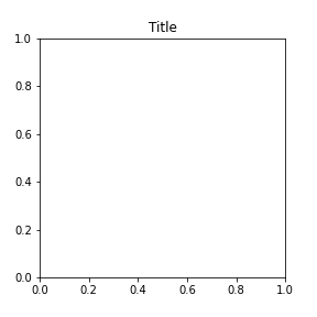
matplotlib.axes.Axes.set_title() は Axes(サブプロット)のタイトルを設定するメソッドです。
# MATPLOTLIB_AXES_TITLE

# In[1]

import matplotlib.pyplot as plt

fig = plt.figure(figsize=(4, 4))
ax = fig.add_subplot(211)

# Axesタイトルを添付
ax.set_title("Title", color="black")

fig.savefig('matplotlib_axes_title')
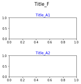
複数の Axes に別々のタイトルを添付できますが、軸や目盛と重ならないように予め余白を調整しておく必要があります。
# In[2]

# Matplotlibをインポート
import matplotlib.pyplot as plt

# FigureとAxes
fig = plt.figure(figsize =(4, 4))
ax1 = fig.add_subplot(211)
ax2 = fig.add_subplot(212)

# Axes(サブプロット)の余白調整
fig.subplots_adjust(top=0.8, hspace=0.8)

# Figureタイトルを添付
fig.suptitle("Title_F", size=15)

# Axesタイトルを添付
ax1.set_title("Title_A1", color="blue")
ax2.set_title("Title_A2", color="blue")
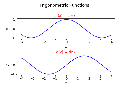
タイトル設定の実践的なサンプルコードを見てみましょう。以下のコードは三角関数のグラフを 2 枚縦並びにして、Figure タイトルと Axes タイトルを添付します。
# PYTHON_MATPLOTLIB_TITLE_EXAMPLE

import numpy as np
import matplotlib.pyplot as plt

# Figureを設定
fig = plt.figure()

# Figureのタイトルを設定
fig.suptitle("Trigonometric Functions", fontsize=14)

# Axesを追加
ax1 = fig.add_subplot(211)
ax2 = fig.add_subplot(212)

# Axesのタイトルの設定
ax1.set_title("f(x) = cosx", size=12, color="red")
ax2.set_title("g(x) = sinx", size=12, color="red")

# Axes(サブプロット)間の余白調整
fig.subplots_adjust(top=0.8, hspace=0.8)

# xのデータを作成
x = np.arange(-4, 4, 0.1)

# yのデータを作成
f = np.cos(x)
g = np.sin(x)

# 軸ラベルの設定
ax1.set_xlabel("x", size=12)
ax1.set_ylabel("y", size=12)
ax2.set_xlabel("x", size=12)
ax2.set_ylabel("y", size=12)

# データをプロット
ax1.plot(x, f, color="blue")
ax2.plot(x, g, color="blue")
関連記事:【Matplotlib】凡例の表示
コメント
前の記事の seaborn のパステル調スタイルの右側のプロット図が、他のスタイルで使われたプロットと異なっています。
本当だ…正しい図に差し替えておきました。
助かりました。ありがとうございます。m(_ _)m